
BOOTSTRAP
What is BOOT STRAP
Bootstrap is a popular front-end framework for developing responsive and mobile-first
websites and web applications. It was originally created by developers at Twitter and
later released as an open-source project.
The main goal of Bootstrap is to provide developers with a collection of pre-designed
HTML, CSS, and JavaScript components and utilities that can be easily integrated into
web projects. These components include things like navigation bars, buttons, forms,
dropdowns, modals, and much more.
Bootstrap also includes a responsive grid system, which allows developers to create
layouts that automatically adjust and reorganize based on the size of the screen or
device being used. This makes it easier to build websites and applications that look and
work well on a wide range of devices, from desktop computers to smartphones and
tablets.
Key features of Bootstrap are:
Responsive Design: Built-in responsive grid system and responsive utilities for creating
layouts that adapt to various screen sizes.
CSS Components: Pre-styled components like buttons, forms, navigation bars, and
more, making it easy to create a consistent and visually appealing user interface.
JavaScript Plugins: Optional JavaScript plugins for adding interactive components like
modals, tooltips, carousels, and dropdowns to your website or application.
Customization: Ability to customize and extend Bootstrap's styles and components
using Sass variables and mixins.
Browser Compatibility: Bootstrap is designed to be compatible with modern web
browsers, ensuring a consistent user experience across different platforms.
Mobile-first Approach / Styles: This refer to a design approach where the default styles
for a website or web application are targeted towards smaller screens, such as
smartphones and tablets, and then progressively enhanced for larger screens, like
desktops and laptops. This approach ensures that the website or application looks and

functions well on smaller screens by default and then adapts gracefully to larger
screens.
Use the below links in your html page
Breakpoints
Breakpoints are customizable widths that determine how your responsive layout
behaves across device or viewport sizes in Bootstrap.
● Breakpoints are the building blocks of responsive design. Use them to control
when your layout can be adapted at a particular viewport or device size.
● Use media queries to architect your CSS by breakpoint. most commonly use
min-width in our media queries.
● Bootstrap uses a responsive grid system that divides the viewport width into 12
columns and allows developers to define breakpoints at which the layout
changes.
Bootstrap provides several predefined breakpoints that target common screen sizes,
including:
Extra small (xs): This applies to screens smaller than 576 pixels wide, typically used for
smartphones.
Small (sm): This applies to screens equal to or larger than 576 pixels wide, typically
used for tablets.
Medium (md): This applies to screens equal to or larger than 768 pixels wide, typically
used for small desktops and laptops.
Large (lg): This applies to screens equal to or larger than 992 pixels wide, typically used
for larger desktops and laptops.

Extra large (xl): This applies to screens equal to or larger than 1200 pixels wide, typically
used for extra-large desktops and widescreen monitors.
In Bootstrap's grid system, you can use CSS classes like .col-xs-, .col-sm-, .col-md-,
.col-lg-, and .col-xl- to define the width of columns for different screen sizes.
Additionally, Bootstrap provides utility classes like .d-none, .d-sm-none, .d-md-none, etc.,
to show or hide elements based on specific breakpoints.
<div class="container">
<div class="row">
<div class="col-xs-12 col-sm-6 col-md-4 col-lg-3 col-xl-2">
<!-- Content for different screen sizes -->
</div>
<!-- More columns here -->
</div>
</div>
CONTAINERS
Containers are a fundamental building block of Bootstrap that contain, pad, and align
your content within a given device or viewport.
containers are the most basic layout element in Bootstrap and are required when using
our default grid system. Containers are used to contain, pad, and (sometimes) center
the content within them. While containers can be nested, most layouts do not require a
nested container.

Hands On
1. Bootstrap CSS https://getbootstrap.com/docs/5.0/getting-started/introduction/
Place this link above title tag
<link href="https://cdn.jsdelivr.net/npm/bootstr[email protected]/dist/css/bootstrap.min.css" rel="stylesheet"
integrity="sha384-EVSTQN3/azprG1Anm3QDgpJLIm9Nao0Yz1ztcQTwFspd3yD65VohhpuuCOmLASjC"
crossorigin="anonymous">
2. JavaScript bundle – place this link before the end of </body>
<script src="https://cdn.jsdelivr.net/npm/bootstr[email protected]/dist/js/bootstrap.bundle.min.js"
integrity="sha384-MrcW6ZMFYlzcLA8Nl+NtUVF0sA7MsXsP1UyJoMp4YLEuNSfAP+JcXn/tWtIaxVXM"
crossorigin="anonymous"></script>
NAV BAR

<nav class="navbar navbar-expand-lg bg-dark navbar-dark">
</nav>
Without using container
<!-- brand or logo-->
<a href="#" class="navbar-brand">LearnSmart</a>
Placing the same code inside the container
<div class="container">
<!-- brand or logo -->
<a href="#" class="navbar-brand">LearnSmart</a>
</div>

Collapse Navbar-collapse is used to render the design based on the screen size.
The screen size is set to large(lg) and when the breakpoint is less than large or medium
the size gets auto adjusted and the navbar collapses accordingly.
<div class="collapse navbar-collapse">
<!-- add list items in ul -->
<ul class="navbar-nav">
<!-- for each item we use nav-item -->
<li class="nav-item">
<!-- for each link we use nav-link -->
<a href="#" class="nav-link">Home</a>
</li>
</ul>
</div>

Use ms-auto in <ul>
<ul class="navbar-nav ms-auto">
If you have noticed the smaller the breakpoint they have item disappear. To
overcome this problem we will use a button and place the items inside a
button and when the breakpoint is small the items will be moved inside the
button.
Classes to use are navbar-toggler
Define a button between logo and navbar items
<!-- define a button and use navbar-toggler class →
<button class="navbar-toggler" type="button"> </button>

Use an attribute called data-bs-toggle and set value to collapse to collapse
the content.
Include data-bs-target and give the Id to link the collapsible content to
button.
Give an id name to the collapse navbar-collapse
<button class="navbar-toggler" type="button" data-bs-toggle="collapse"
data-bs-target="#navmenu">
</button>
<!-- collapse class is used to collapse the navbar based on the break
point -->
<div class="collapse navbar-collapse" id="navmenu">

As you can see the toggle button has no icon inside it . To place an icon
inside the Toggle button we use span element followed by class
navbar-toggler- icon
<span class="navbar-toggler-icon"></span>
Showcase
Define a Section using <section> use bg-dark for the background of the
section; text-light for the text color; p-5 padding ; text-center to alight the
text.

Note: padding can be defined as either pt-1,pt-2,pt-3,pt-4,pt-5 similarly we
use pb, px, py where pt is Padding top, pb - padding bottom, px - padding x
axis; py padding y-axis.
<section class="bg-dark text-light p-5 text-center">
</section>
You will notice zero change. Define a container class in section and you will
be able to see the changes.
<section class="bg-dark text-light p-5 text-center">
<div class=”container”>
</div>
</section>
Define a flex box using div tag and create a div and an img inside it
<div>//flex box
<div>
<h1>The Best Place To Learn</h1>
</div>
<img src=”sample.svg”>
</div>

To align them side by side we use a class called d-flex to implement flex
box
<div class=”d-flex”>//flex box
<div>
<h1>The Best Place To Learn</h1>
</div>
<img src=”sample.svg”>
</div>

To place the image inside a container we use a class inside the image tag
by name “img-fluid” w-50 reduces the image by 50%
<img src=”sample.svg” class=”img-fluid w-50”> below is the output
without img-fluid and with img-fluid class
To Disable Flexbox on small /mobile
Screen use breakpoint sm on flex cla
Ss.
D-sm-flex

Buttons
class=”btn btn-primary”
Alerts
Must be placed in div class and write the alert message accordingly.
class=”alert alert-primary”
Images
Used to display images either rounded/ circle / in thumbnail format.
class=”img-rounded”
class=”img-thumbnail”
class=”img-circle”
<img src="1.png" class="img-thumbnail" alt="ashneer grover"/>
<img src="1.png" class="img-circle" alt="ashneer grover"/>
<img src="1.png" class="img-rounded" alt="ashneer grover"/>

Badges
Badges scale to match the size of the immediate parent element by using relative font
sizing.
We use “badge bg-primary” class for the following output.
<h2>
Oversleeping is <span class="badge bg-danger">Bad</span>
</h2>
Class =”badge rounded-pill”
<button class="btn btn-primary">
Inbox <span class="badge bg-dark">99+</span>
</button>
Dropdown
A dropdown menu is a toggleable menu that allows the user to choose one
value from a predefined list.
If you want the items to be triggered to the top use
dropup class
dropend triggers to the right and dropstart to the left .
<div class="dropdown">
<button class="btn btn-secondary dropdown-toggle"
data-bs-toggle="dropdown">Subject Lists</button>
<ul class="dropdown-menu" >
<li><a href="#" class="dropdown-item">SPM</a></li>
<li class="dropdown-item">Web</li>
<li>MS</li>
<li>RM</li>
</ul>
</div>

Collapse
The collapse plugin is used to show and hide content.
Buttons or anchors are used as triggers that are mapped to specific elements you
toggle.
<p>
<button class="btn btn-primary" data-bs-toggle="collapse"
data-bs-target="#fullstackcollapse">fullstack</button>
</p>
<div class="collapse" id="fullstackcollapse">
<div class="card card-body">
Full stack development is the process of developing both the frontend
and backend of applications.
</div>
</div>
</div>
Pagination
Pagination is the concept in which, we divide our records into multiple sets
where each set contains the same number of records. We display each set
of records on separate pages in the application.
In React Js, we implement the page in such a way that it is divided into
multiple pages. And depending on the page number, we fetch the
corresponding set of data and display this particular set on our React page.

Consider we have a dataset that consists of 500 records that a user of the
application may request. Let us assume that we are interested in showing
only 10 records on a single react page.
Consider the below code and output
After applying Pagination class to ul the out put is as follows
As pagination divides the response from the db into navigational pages
with equal records, we use page-item class for li elements and page-link
class for links elements (anchor elements).

Applying the classes on li and <a> we get the below output

We place the entire code as part of <nav> as we are implementing
navigational links . we also use aria-label - this is an attribute which
provides description about the navigational component . it is always
recommended to use meaningful label names.
In addition to this we can define the size of the pagination elements by
declaring the breakpoint.
We use pagination-lg /pagination-md-pagination-sm …classes accordingly.
We will mention this class in the unordered list element.

We can align the pagination to center or to the right of the page by using
justify-content-center / justify-content-end.
Tables
Tables in Bootstrap uses the following classes and attributes
Table tag
class
attrib
ute
value
remarks
<table>
.table
.table-primary
.table-secondary
.table-danger
.table-info

Stripped
table
.table table-striped
.table table-striped
table-dark
Hoverable
table
.table table-hover
Active table
.
<th>
scope
col
<tr>
.table-primary
.table-secondary
.table-danger
.table-info
<td>
.table-primary
.table-secondary
.table-danger
.table-info
borders
table-bordered /
table-borderless
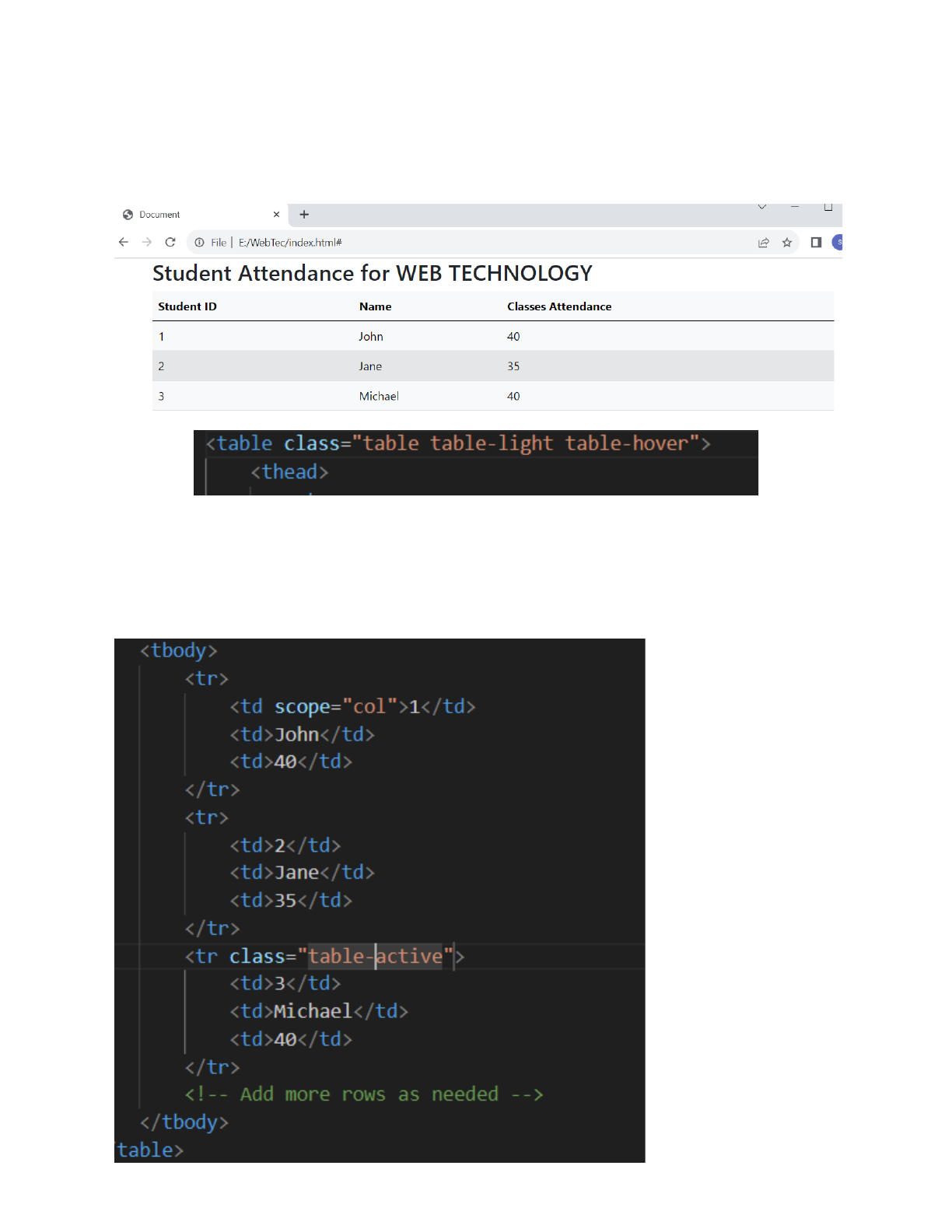
Consider the below table
Forms

BootStrap Carousel Plugin
Let us apply the bootstrap classes to change the look and feel of the table
Class:table
Class:table table-primary
Class:table table-primary
Class:table table-dark

And all the inbuilt classes such as table-secondary, table-warning,
table-danger, table-info, table-light .
Class:table table-striped
Class:table table-striped table-danger or any combination of previous
table color classes.
Class:table table-hover table-light or any combination of previous table
color classes.
class : table-active is applied on to table row or on to table column to
highlight the row or column when the table is loaded onto the webpage.

In the above code row 2 is set to active and when the page is loaded it
highlights row 3.
Class:table table-bordered
We can also use table-bordered along with border-primary and other
border-defaultcolor classes (secondary/warning, danger etc)

CAROUSEL PLUGIN
A slideshow component for cycling through elements—images or slides of
text—like a carousel.
The carousel is a slideshow for cycling through a series of content, built with CSS 3D
transforms and a bit of JavaScript. It works with a series of images, text, or custom
markup. It also includes support for previous/next controls and indicators.
● .active class needs to be added to one of the slides
● Also be sure to set a unique id on the .carousel for optional controls,
● Control and indicator elements must have a data-bs-target attribute (or
href for links) that matches the id of the .carousel element.
● the .d-block and .w-100 on carousel images to prevent browser default
image alignment.
Classes - carousel, carousel slide, carousel-inner, carousel-item, carousel-item
active; d-block w-100

https://drive.google.com/file/d/1mc1paMbRCoRNsPlu4AeJeZDg1TkV2LMM/vie
w?usp=drive_link
Use the above link to see the output of carousel
Additional Information on carousel
To add controls to carousel we use button element or <a> element with role
=”button”
Classes to use are : carousel-control-prev /carousel-control-next
Carousel-control-prev-icon /Carousel-control-next-icon
Visually-hidden

<button class="carousel-control-prev" type="button"
data-bs-target="#slidingimages" data-bs-slide="prev">
<span class="carousel-control-prev-icon" aria-hidden="true"></span>
<span class="visually-hidden">Previous</span>
</button>
<button class="carousel-control-next" type="button"
data-bs-target="#slidingimages" data-bs-slide="next">
<span class="carousel-control-next-icon" aria-hidden="true"></span>
<span class="visually-hidden">Next</span>
</button>

FORMS
